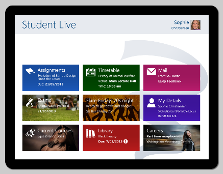
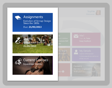
Did you know SharePoint could look like this?

We’re currently working with a large FE College on a SharePoint 2013 implementation and together we decided to give SharePoint a Windows 8 style makeover to make it more appealing for their students and simple for everyone to find the information they need on any device.
We wanted to share some of our initial screenshots with you as we are pretty excited about how they look and it shows just how much design and customisation can be achieved in SharePoint 2013.
There are applications for this sort of design in many industries, not just education. It would work well for a customer or supplier landing page, allowing them to click through to the information they need.
SharePoint can also be used for websites, and this kind of design would work well if your website is often viewed on smart devices or you want to make it easier for people using tablets or mobiles to access the content they need. Because of this, SharePoint 2013 is a great way to embrace the trend of bringing your own device (BYOD) to work.

Tiles update regularly so they always display relevant information. In this case, each and every student can access their key and current information at a glance and click the tiles to get more detailed information in a particular area.
This simple, design focused look is only possible because of the powerful tools for developing with HTML 5 in SharePoint 2013. These allow us to build a responsive SharePoint web design that delivers an interface to suit the device in use.
If you like the look of this design, why not drop us an email today and find out how we can build an integrated SharePoint with functional design for you and your company.

